My Favorite 70’s Fonts
It’s no secret that I have a thing for the 70’s. So I spend A LOT of time trying to find the best fonts to bring a vintage vibe to my designs and the brands I work with. Below our my top 5 favorites, which one is your favorite?
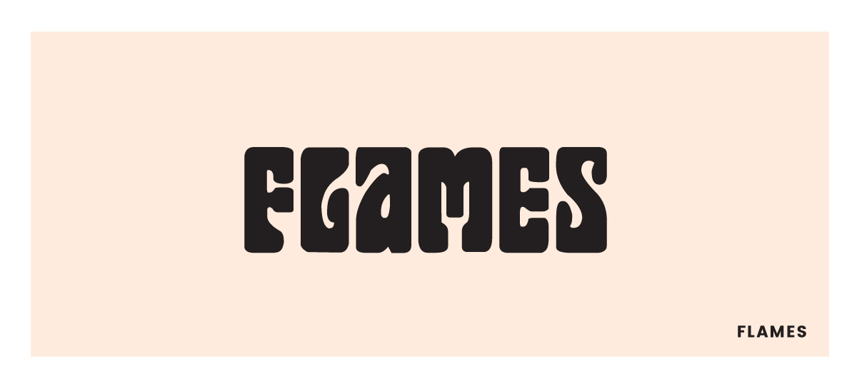
Flames is one of my favorite fonts to stack. I love a thicc font, am I right ladies?
Download Flames (for free!).

If I could use Cooper Black on every single wallpaper I designed I would. It has to be my #1 favorite font right now. So fun, playful, and the perfect amount of vintage vibes.
Download Cooper Black here.
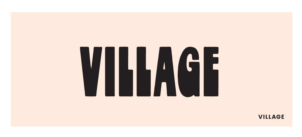
Village is another font by the same designer of Flames that is so fun to stack. This has a bit more of a modern feel with the straight lines, but is just as playful as the others. Kind of reminds me of what a Bratz doll would choose for the favorite font. Download Village (for free!) here.
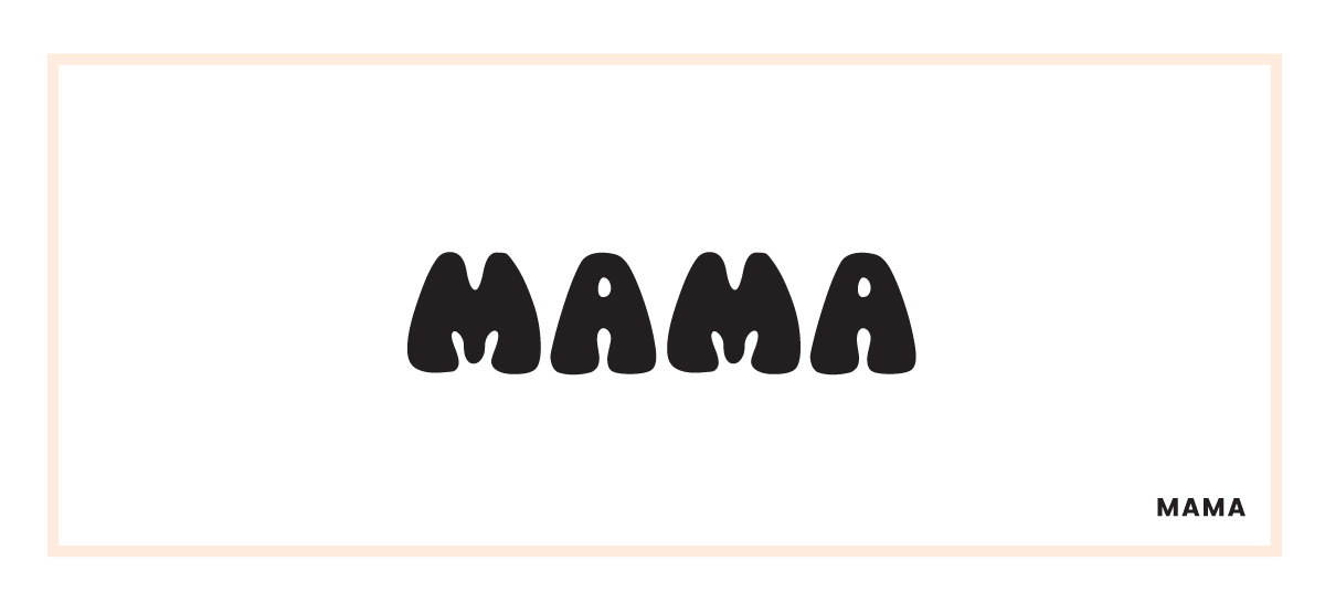
I have yet to find a project to use this on, but I’m looking for one! This has more early 70s vibes and is a lot more stylized than the others, I think that’s why I’ve had a hard time finding something to use it on. Download Mama (for free!) here. Let me know if you find somewhere to use it!!
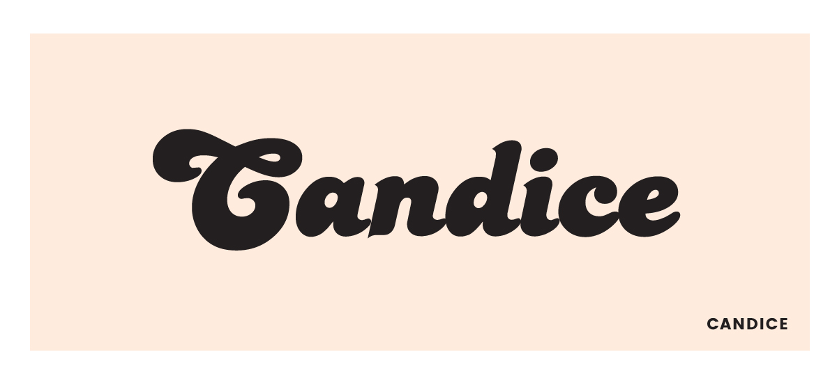
Candice is the font that’s comes to my mind first when someone asks for a 70’s vibe font. The extra huge capitals combined with the sweet, Cooper-esque lowercase, makes for a fun design as a quote or on a t-shirt. Download Candice here.